Friday, 7 December 2018

Easing the pain of importing Mesh.

A quick guide to the Mesh uploader changes in Firestorm 6.


But first a quick mention of the "other thing"

The big new thing in Firestorm 6 is, of course, Animated objects or "Animesh" which gives you the ability to take any rigged mesh item that you have modify permissions on and turn it into an animated independently moving item. You can read all about Animesh on the Linden Lab blog the regular places such as Inara and Nalates' blogs. Having spent quite a lot of time over the last few months looking at performance concerns around Animesh and tweaking some of the performance of rigged mesh in general, I am relatively happy that Animesh has an overhead not too much more than if that same mesh were being worn as clothing today. That is to say that a single animesh  of say 30,000 triangles will have an impact on your performance more or less equivalent to a 30,000 triangle dress or xmas sweater.
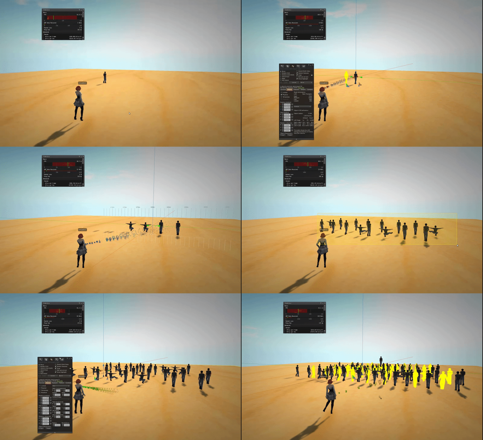

And now on to the main part of the blog...

A side-show to the main event of animated objects, nestling amongst the many fixes and tweaks since the last release, is my revamp of the Mesh Uploader. I teased some of the information on this previously but I'll now give a quick guide to the updates.

What's changed?

  • Cost breakdown, how the L$ charge is calculated
  • Physics details, the costs of the different types of physics (convex hull, prim)
  • Higher resolution preview image
  • Scalable preview window
  • Improved shading/lighting in the preview window
  • Correct highlighting of degenerate mesh
  • Improved error handling for physics models (avoid some of those MAV errors)
  • UV Guide overlay

Why?

So why change the uploader? Primarily because it is awful. A lot of creators struggle with the obscure and limited error handling, the postage stamp preview and poor rendering. The aim is to improve the tools, this is really the first step in what I hope will be a series of improvements both in the capability of the import tools but at least as importantly, in the feedback you get when things go wrong.

So what are these changes?

First of all, we'll look at additional information panels.
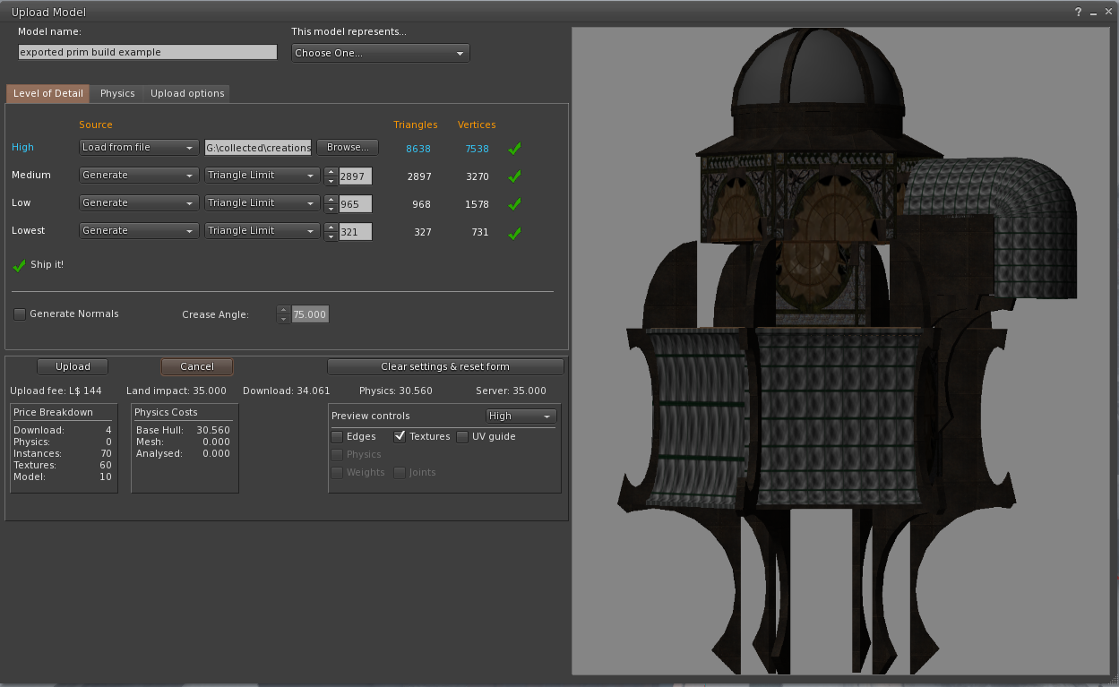
Taking the following object (an old prim building exported from SL)


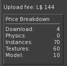
Cost breakdown:

Ever wondered why that first upload cost you L$15 but the one after cost L$25? This information panel will at least tell you where that final number comes from.

The Download fee is derived from the streaming cost of the mesh, shown as "Download" in the standard Land Impact stats.
The Physics fee relates to the cost of the physics model. It is worth noting that the Convex Hull (Base Hull) is free, while a User supplied physics is charged based on its complexity whether it is mesh or analysed (more on that later).
The Instances fee is L$1 per mesh "prim" in the linkset. As can be seen this build has 70 separate meshes in a single model. 
The Textures fee is the standard L$10 fee per texture upload and is only added when the "inlcude textures" box is ticked on the "upload options" tab.
Finally, the Model fee, is normally L$10, the core upload fee irrespective of the complexity of the scene. It may be possible for this to be more in a multi-model DAE but I have not had a chance to test one.

Physics breakdown:

Personally, I think this is the more valuable of the two new panels. It has always been guesswork as to what the inworld physics cost will be if you use anything other than the default convex hull. 
This panel shows you the possible physics costs. There are 3 values shown but typically only two of these will have a value at any given time.
Base Hull: I should probably rename this to Convex Hull to correspond to the inworld name. The Base hull is the default physics shape, every mesh has one of these, in fact, if the uploader is unable to calculate a credible "base hull" you will get a dreaded "MAV block missing error".
This cost is the one traditionally shown in the LI summary because it is the default state of a newly uploaded mesh. However, if you provided your own physics shape, then inworld you can set the physics shape to the equally confusing "Prim". The next two values are related to the "Prim" physics

Mesh: User Mesh physics, this is the value is you have provided a Mesh model and not used the Havok Analyse function. It can sometimes be cheaper than the analysed equivalent but as all regular readers of this blog will know, it can vary with scale. The cost shown assumes the scale as uploaded.

Analysed: If your user-specified MEsh is analysed (and optionally simplified) using the Havok tools then when the fee is calculated it is based not on the original Mesh model but instead on the number of hulls. Using this new info panel you can, therefore, check the non-analysed physics cost and then examine the analysed costs and decide which you prefer before you upload. 

Moving on from the info panels, we'll look at the most obvious visual change, the preview panel itself.

The preview panel:

There have been a number of alterations to this panel. Firstly I have changed the Colour scheme to be more aligned with the inworld editing, yellow highlight for the edges, with translucent blue for physics. these can be overridden in the depths of the debug settings if you really want.

The next change is my favourite, the scalable preview window. The rearranged upload "floater" is already giving you a larger preview are, but depending on your screen size you can now grab the lower right corner and scale it out to as large as you wish. This comes in really handy for identifying those pesky degenerate triangles in your physics mesh. Alongside the increased physical size I have also increased the resolution of the preview giving a less jagged feel to the render. 

A more subtle change is the lighting of the model. The preview window always had very deep dark shadows and investigation showed that this was not actually the intended behaviour but that the 3 point lighting implementation was broken. I have made a quick fix that improves the general lighting but I have future plans to do more with this.

In addition to the existing edges and textures options, I have introduced a new "UV Guide". This displays a simple checkerboard pattern over the mesh and is useful for ensuring that you exported the right UV map before you get inworld. It is possible to add your own UV Guide and in a future release, I hope to make that directly editable from the preferences.

The final visual change was to fix an annoying bug that has meant that the intended "helpful" diagnostic display to highlight the presence of degenerate (i.e. long thin) triangles was more or less indistinguishable from the build. These errors in the physics mesh which were previously highlighted with tiny black lines marginally thicker than the mesh display are now highlighted clearly in bright red.

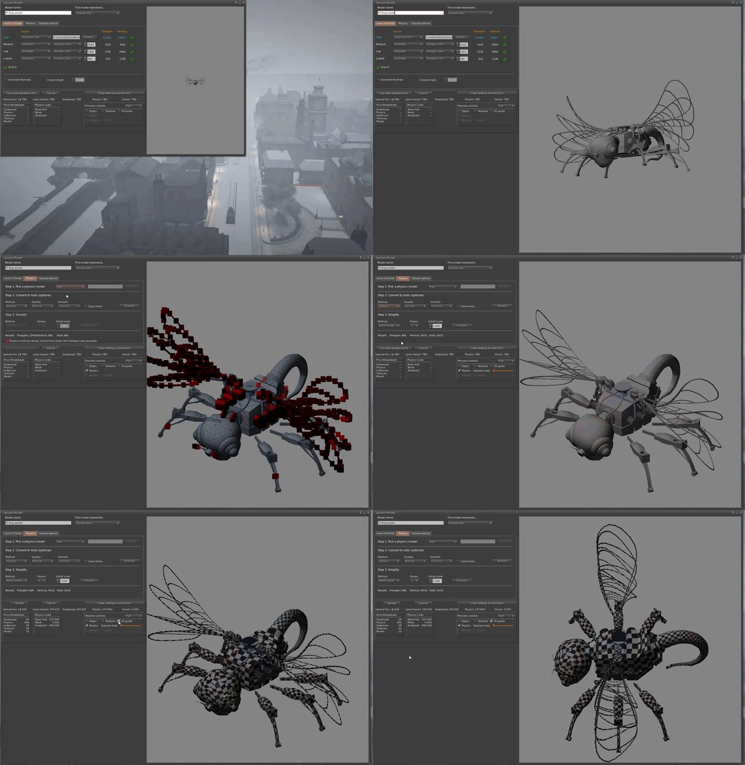
The following animation shows a quick overview of the new preview window


Finally, at least for this "overview", I have attempted to improve the error handling workflow.

Improved Error Handling:

Anyone who has spent any time uploading Mesh or helping others to do so will have suffered the pain of the obscure and often misleading errors. In this refresh I have tried to ease the pain a little, there's still some way to go I'm afraid but I hope that this start will save people some of the worst of the shortcomings of the old uploader.

Intercepting MAV errors....wait, rewind .. What is a MAV error?

MAV stands for Mesh Asset Validation (or something close) it is the process that occurs when you click the calculate weights button before the server decides on the costs. A MAV error is, therefore, one of a number of "fatal" errors that prevent the mesh being considered as well-formed and given a set of costs and weights. The annoyance factor of these is two-fold, firstly you have to click the button and wait for the response from the server, and secondly, you have to decipher the meaning of the error message. These MAV errors also commit the cardinal sin of error handling "Please look in the log for more information", if you've ever tried to look in a viewer log file and work out what went on you have my pity. 

MAV Errors then and now

There are four main MAV errors that I can think of:-
MAV error block missing: I referred to this earlier, and it can occur for a number of reasons, unfortunately, and because of this, for now at least, I have not trapped this one. The "block missing" means that part of the Mesh data structure was not present when it reached the server. This is purely a technical fault and of no use whatsoever to the user, so what causes this? The Mesh data upload structure has a number of mandatory "blocks" these include the LOD data, a convex hull etc. The most common (in my experience) occurrence of  "Missing block" is when the mesh is so poorly optimised that the convex hull creation failed. another cause is, once again, overly complex mesh that causes the LOD generation library (GLOD) to fail to produce an adequate simplified LOD.  There may well be others.

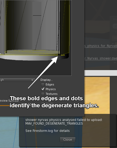
MAV error: Degenerate Triangles: (Now trapped) Traditionally this has been reported when your user-defined mesh physics shape is too complicated and in particular it has one or more long thin triangles. These are an error because they cause significant issues for the physics engine. As mentioned above I now highlight these in bright red, and this occurs as soon as the user mesh is specified. along with this the calculate button is deactivated (you would only get a MAV error so I am saving you from yourself) and a red error message explaining the issue is shown.

MAV error: Some hulls exceed vertex limit: (Now trapped) In the past your mesh was sent off for evaluation but I now perform this in the preview itself. Hulls are a simple convex shape made up of at most 256 vertices. If the analysis produced more complex hulls then this cannot be stored in the mesh data structure and is a fatal error to the uploader. This is now trapped and flagged as an error, the calc/upload button disabled and a suggestion of how you might fix the issue provided with the error.

MAV error: Too many hulls: (Now trapped) In the past, you would get a MAV error if your analysed results gave more than 256 hulls for any single instance (aka mesh unit) in the model. Once again this is a technical limitation imposed by the system and it prevents the model being uploadable. This is trapped and provides a suitable error and a suggestion of how to fix the problem. As you might expect by now, the calc/upload button will be disabled.

That's all folks

That about rounds up this Blog and the uploader changes. As I have said a few times above, this is the first stage of what I hope will be a more complete revision. If this is well-received I will look at the feasibility of contributing this back to the Linden Lab viewer so that everyone (not just Firestorm users) can take advantage of it. The Mesh Uploader is a complex and fickle beast and while I have tried to cover many areas and check for loopholes there is a chance I missed some. I have also deliberately neglected the rigged mesh tools a little, both to focus the changes and to not mix up any issues with uploader changes with Animesh.

Love 

Beq
x


Wednesday, 3 October 2018

Shedding light on Mesh uploading - Something I'm playing with...

For some, the entire Mesh upload process is wreathed in fog, a murky, mystery-filled place of confusion. Sometimes this is down to misinformation and poor tutorials out here on the web, but the Mesh uploader does nothing to help its own reputation.

With the above thought in mind, I've started to make a few tweaks to the uploader. Nothing major here but I thought I would share a little of the direction I am going in and see what the feedback is.

While I want to address a number of different problems, from the error reporting to the preview window, I've started with some additional information displays. It has been mentioned many times in the forum that the Mesh uploader is a little "random", and whilst there is a grain of truth to that, it is also in large part due to the opaque nature of the numbers we see. In particular, where is the cost derived from and why does the physics shown on the uploader bear no resemblance to that which we see inworld?


Blogger will downgrade this clip but you can peek at the original here

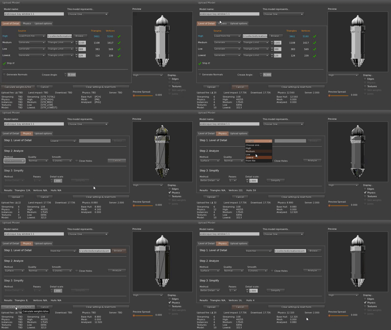
Very rough and ready but what this shows is some extended information that is returned when you "calculate weights & fee". So what goodies do we have here?

There are 3 sets of information I am showing, we will ignore the middle one for now as it is not useful in its present form, so that leaves...

1) The contribution to the fee

As you can see, your upload fee is derived from a number of components:-

Streaming

Streaming is a charge derived from the streamable size of the object.
Physics
Physics is a fee derived from the physics model, and you can see that it varies with the physics costs that are normally hidden from sight.

Instances

Instances is a little misleading, it is not used in the context of repeats of a mesh, as those familiar with 3D modelling might use the term, it is instead derived from the number of mesh units making up the model. It is effectively the "prim count"

Textures

I don't show this in my quick clip above but it is the 10L charge for any textures uploaded with the mesh. Uploading textures with the mesh has always been an option but to my knowledge is rarely used.

Model

I have never yet seen this as anything other than the 10L value shown in the clip. I suspect in the workflow it is effectively hardcoded.

And so on to the (arguably) more interesting information.

2) The physics costs

Here we find the hidden cost of physics. For years we've moaned about the fact that the Physics cost shown has little relation to that which we get after upload. Most of us will have made the link to the fact that the physics cost shown historically is just the "base hull" cost. That is to say, it is the cost assigned to the shape that is used when "convex hull" is selected. This is the default physics shape post-upload and is a mandatory part of the uploaded asset.

But we can also provide a custom physics model, if we choose to provide it as a mesh then a weight based on the number and area of the triangles that comprise that model is computed. While it has not been visible until now, it does influence the price we pay. For reasons we have discussed in this blog many a time in the past, there are occasions where a Mesh physics model is not suitable; in those cases we use the "analyse" function to convert the triangles into a set of hulls, or a "decomposition" in viewer-speak.

While a base hull is mandatory and always present, the mesh and hull based user supplied physics shapes are mutually exclusive, you may only have one. As such pressing analyze and then calculating weights will blank out the Mesh cost and retrieve an Analysed cost.

Will this help you?

OK, so that's it for now. How this will actually appear in a future Firestorm I'm not yet sure. There is a fine line between providing more information and causing more confusion. so while I think it will appear in some form I'll be hoping to discuss it with users and our support team as well.

Personally, while seeing the composition of the fee is interesting in passing, it is not essential and anyone tailoring their mesh to minimise the upload cost really needs to consider their motivations. However, knowing exactly what the physics cost will be in-world before you upload is a massive time saver and I believe that this will be popular with my builder friends.

I'd love to hear your thoughts on this. Am I completely off-piste here?

Saturday, 25 August 2018

Why did my LI just explode, I only linked in two simple prims?

Another tale from the tavern

The long-suffering bar staff at the builders' tavern can share many a tale heard over the sobs of a builder, driven to drink by the seemingly implausible accounting of Second Life. One of the more common tales is "the case of the lunatic link set". There are a few variations on this tale, but the underlying story remains the same.

TLDR; 

Too lazy to read? Simple summary, when building link sets of prims be wary of mixing "new" features and the potential knock-on effects on seemingly innocent prims.

Once upon a time

Our happy builder starts his day merrily slinging prims as he builds a new home. Carefully avoiding linking any meshes to the link set (he's been caught by that before) he finishes around midday, and step back to look at his pretty little 28LI home. He muses over the building as he nibbles a cheese and pickle sandwich.

"You know what?" he says to himself, "it's just missing that little something extra. A little finesse on the front porch."

Putting aside his lunch, he quickly knocks up a couple of simple decorative columns from cylinders, popping on a normal map to give them some nice fluting, he links them into the build. 30LI, very nice, but the columns look unfinished and then he realises, they need a base and capitol. He quickly whips out a couple more prims, one torus top and bottom of each, 4LI extra, still a decent count for a prim house. He links them together and carries on working, it isn't until he stops for a tea break in the afternoon that he looks up and sees that his house now has an LI of 290.

In shock and denial, our builder paces up and down scratching his head. He checks every link in the link set, no meshes, not even a sculpt, (he never really trusted those). He unlinks and relinks, changes colours (cos why not?), restarts the region and moves to another sandbox. So distracted, in fact, that he lets his cup of tea go cold. In frustration, he downs tools and heads for the tavern.

So what is it that drives up the LI and the profits of virtual pub landlords?

He recounts the tale to the ever-patient barmaid. Explaining that he checked every single prim in the build, unlinked the entire thing and reassembled it, no single part has an LI more than 1 and yet when the 34 prims are linked the LI is many times more than the sum of the parts.

The barmaid smiles and pulls him another pint.

"You've used materials, 'aven't ya m'dear?", he blinks, she looks at him; "That'll be 2 Lindens please"

"What? oh!" He pays for the beer, "yes, yes, I used a little normal map, gives these lovely fluted effects to the columns, but even with the normal map those are only 1LI"

"Aye, but I bet you've got some toruses in there, right?" He blinks again, she's not wrong, but what on earth has that got to do with anything.

"I do, of course, but I checked them they are only 1LI too"

"Go back and look again, but look closely this time." She writes a little note on the beer mat, it simply says "Ask for more info"

Back to work

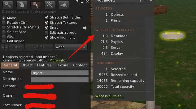
Somewhat puzzled he heads back to the cottage and once again starts to look through the prims, all at once he notices the "more info" link hidden on the object details.


His toruses are costing him 72 LI each, or so it says, but he checks again and sure enough, it says 1LI, what is going on? All of a sudden a distant memory comes to mind. It's not just Meshes that cause the LI to go mad. It's other stuff too... He hunts around and finds a long forgotten post on the community notice board.


The builder stares for a moment, taking in the new information.

"So," he muses, "the normal map on the cylinders may have seemed innocuous because their cost never changed, but it forced the entire link set to use the modern mesh accounting, which means that my pretty torus plinths are costing me a fortune because of the number of tiny triangles." Reinvigorated by new knowledge our builder hero, edits the link set and carefully sets the physics shape of the 4 toruses to be "none" eliminating the physics overhead, reducing the load on the physics engine and making the world a better place in all ways,.

And they all lived happily ever after...

Until the following morning, when while glazing the windows, the builder chose to use alpha masking (because it's better all round right?) and was later found sobbing into another pint of Builder's Bane.


Afterword

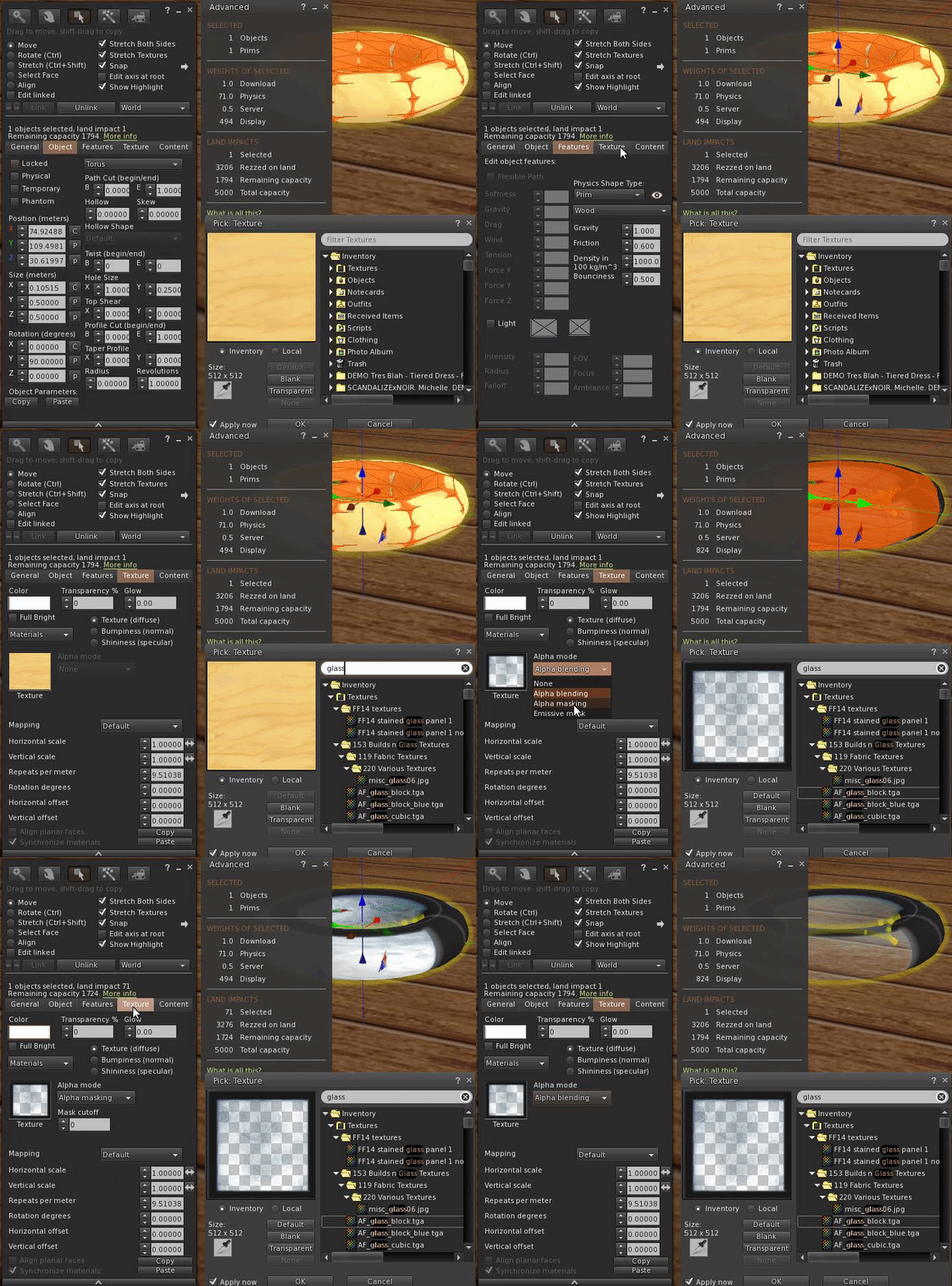
The moral of this story is that any link set that uses a post-2011 feature such as mesh, materials or alpha masking will remove the legacy prim accounting cap from the entire link set. The most common case is linking to another Mesh but be aware it is more nuanced than that, as our merry builder friend discovered. Take heart though, all is not lost, you can use those whizzy new features, just take care to minimise the side-effects. Often this means you just need to find the culprits (the firestorm "show physics shape" can help here) and set their physics to none.

Friday, 8 June 2018

The Degeneration game - Nyrva's shower - a simple case study in physics shapes in Mesh Studio


I often come across frustrated builders who have struggled along the right path but for various reasons not quite got to the destination they had hoped. It often reads like a storybook, as our wannabe mesh warrior stumbles into the local inn, seeking solace and with a plea for help.
Nyrva: Hello, question please. If I am trying to build a "sci-fi shower" for RP, that you have to be able to walk inside of, do I have to make it square and boxy in the mesh and physics in order to avoid the "Degenerate Triangles" problem on import? It seems I'm not allowed to do a cylindrical design.


We meet our hero part way through their quest. They've already confronted the uploader troll, and unable to answer the riddle of the degenerate triangle, have retreated for help.


Back in the village tavern, our quester gets a lot of well-meaning advice. It variously consists or perpetuating myths and old wives tales, or valid advice that helped someone once, but does not really help our hero.
helpful soul#1: cylinders can be a pain ... i have found it "cheaper" to make the sides from a number of "box" type prims  for the physics
 helpful soul #2: your physics can be made up of a number of cube prims arrounged in a circle... sounds a pain ...but it is cheaper LI wise ( and i havent a clue why that is so ). I once made a smoke stack for a steam boat .... mesh funnel ... for some reason .... i forget why i need it physical ...... i was lazy and added a normal ( transparent ) cylinder when i added the prim cylinder to my mesh funnel the LI blew through the roof ....???? ( so i made a mesh physics one)
helpful soul #3: Also zeroing out the low and lowest LOD helps lower the LI because you wouldn't be looking at the shower from across the sim
In this case, all good advice in the right place and time but missing the point. Our embattled builder hacks away for a little longer, gets frustrated and gives up, limping defeated to the marketplace to buy something less fulfilling.

So what was the problem?

The MAV errors reported by the Second Life are often considered as dark arts, a kind of voodoo curse that nobody understands, but mostly they are just annoying badly reported errors. MAV comes from Mesh Asset Validation, so this was failing during the validation phase. OK, but what is a degenerate triangle? In mathematics, a degenerate triangle has zero area. In SL and other games use cases a degenerate triangle is one with a very small area. The degenerate triangle check, in SL, goes a step further and penalises "long thin triangles" which are defined as triangles where any one side is more than 10 times the length of any other side.

So the problem is that we have some tiny, probably stretched triangles. This is one of the reasons why I keep repeating over and over that a physics shape must be as simple as possible. If you have a triangle that fails the degenerate check you have definitely not optimised that model.

In the case of our intrepid mesher, they'd not removed all the hidden surfaces and thin edges. This is a common error, people think "this is a physics mesh, not a visible mesh so I don't need to hide the geometry, but it brings us back to rule #1 of physics shapes, every triangle that does not need to be there is a triangle too many.

Right then, how do I find these things?

Once you know what the cause is, it is often quite obvious where the problem lies; however, what many people do not realise is that the much-maligned uploader tries to help you. When it finds a degenerate triangle it will highlight it in the preview window.


Happily ever after?

Does this story have a happy ending? We left our hapless builder being bombarded with advice over a beer in the local tavern, but how did it end?

Having been asleep when this tale started, I caught up with Nyrva when I woke to see how they'd got on. 

Me: Hi, did you get past your problem earlier?
Nyrva: no, never did. just wound up buying something off the MP for 55L$. I couldn't make anything below 5LI. For me, it's just another item on the "What MS can't be used for" list. lol!"


Never one to pass up a challenge I asked Nyrva to send me the item. I was able to get the shower to be 1LI with a full physics shape relatively easily. So what magic did I use? Nothing really just careful attention to that law of physics models, delete every triangle that is not absolutely necessary,

The rest of this blog is a brief step by step guide through the process.

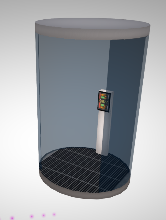
The visible mesh is always a good starting point.
As we can see the structure is very simple, with no obvious reasons why we cannot get a very low LI. The only complexity is that it is cylindrical, in fact, the cubicle is just 3 cylinders, one of which is hollow and 1/4 cut. 

Cylinders are made up of a series of flat edges, a cylinder in SL is by default 24-sided, and in Mesh studio you can step down to as low as 3 sides (where your cylinder will appear as a triangular prism)


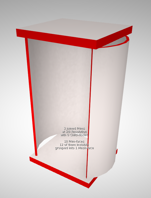
For the visible mesh in the High LOD model leaving the default setting will be fine. However, for the physics, we need to economise.  I chose to use the cylinder and set the number of side to 8 in Mesh Studio, with the quarter cut away this results in a 6 sided cut cylinder, which is 12 triangles on the inner face and 12 triangles on the outer. however, there are also two long thin triangles on the vertical edges and 12 small triangles on the top and bottom surfaces. These triangles are extraneous and also quite likely to be degenerate, I have marked them in RED to highlight them. All of these should be made transparent in the model before meshing.

The two "caps" top and bottom do not need to be curved at all. Leaving them as cylinders, even 8 sided cylinders would have resulted in 16 triangles ( 8 top, 8 bottom - assumes we remove the 16 around the sides). Unless there is a very specific need have the physics shape match the shower visual shape using a square and getting just 4 triangles is far more efficient.

Some of you will be shouting, "but you don't need the underside and the inside surfaces. It is true that the inner shower wall and the underside of the shower ceiling are probably superfluous and would have been the next optimisation if this had remained higher. Note that we cannot remove the underside surface of the floor because we need to have at least one triangle there to match the bounding box of the mesh and avoid stretching.

Uploading with the original visible mesh resulted in a 1LI cylindrical shower. 


Bonus feature

There was a curious outtake during the making of this blog. having duplicated the curved shower glass and used it as the basis of my physics, I made the long thin edges and the top surfaces transparent and generated a mesh.

It refused to accept this as the physics, giving a Degenerate Triangle error. Looking at the image in the upload preview it was clear that the problem was that long thin cut edge, but it was equally obvious that there were no triangles there.

The problem was a little more subtle. Sometime during the editing of the original cylinder Nyrva had picked up a rounding error. and the cut was set to 1.2495 instead of 1.25. When Mesh Studio generates the mesh it obeys this. 0.125 is 1/8 of course. the size of one of our segments in our physics, so what Mesh studio was actually generating was 6 full-size sides and a tiny slither of the 7th side, which was of course, degenerate. Correcting the rounding error fixed the issue.

Saturday, 20 January 2018

For LOD's sake stop!

TLDR; Increasing LOD Factor increases lag. Just say no!

Introduction - Bad design is slowing you down.

Is your Second Life slower than you'd like? Do things grind to a halt when you visit a busy region?
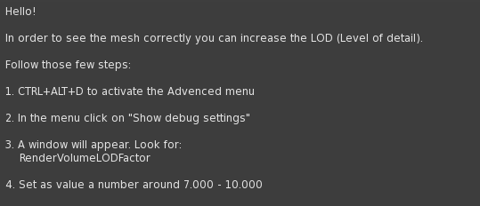
Have you read a notecard like this and followed its advice?

These things may well be related. Notecards such as the one above are sadly widespread, and I suspect that in many cases the designers suggesting this don't fully appreciate the impact their advice can have.

Higher LOD Factor = Lower FPS. 

Let's be very clear, the higher this LOD Factor setting, the longer it takes to draw the scene (frame), which means fewer frames per second (FPS). Lower FPS is a part of what many people call lag.

In the new release of Firestorm (5.0.11), the viewer will warn you if you have unusually high settings, and settings that are considered too high for general use will revert to defaults after a restart. This is done in the hope of improving the overall user experience by encouraging more creators to design efficient, well-behaved content. In 5.0.11 the limit for "normal" use will be 4; this may reduce further in the future.

The remainder of this post will try to de-mystify the "techie" terms LOD and LOD Factor and discuss why you should prefer content from creators who take the time to make Second Life–friendly products.

What is LOD?

LOD is an acronym representing "Levels of Detail", a standard mechanism in computer graphics that is used to reduce the amount of work required to draw a scene by using simpler forms of objects that are smaller or further away. The faster a single scene can be drawn, the more times per second it can be redrawn and the faster and smoother your in-game experience will be.

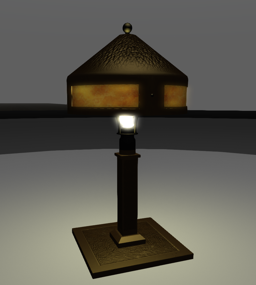
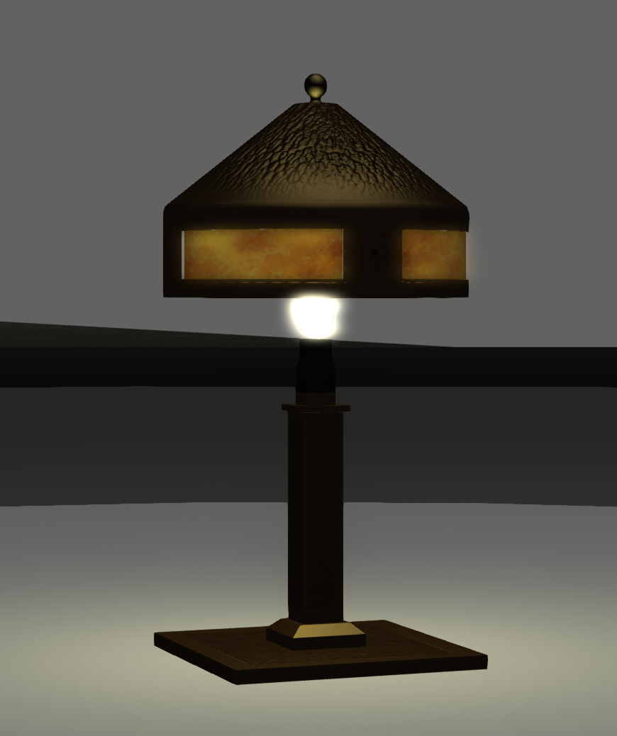
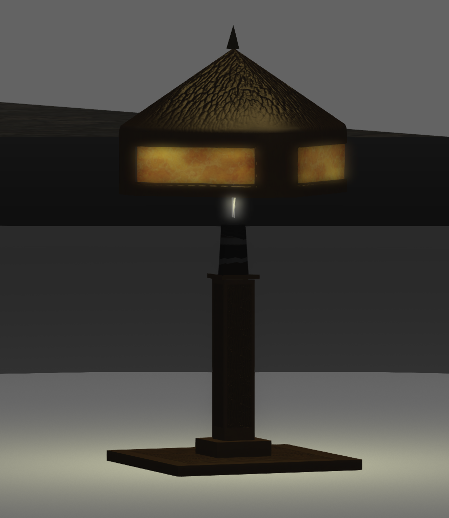
In Second Life objects are constructed from up to four versions of the same item, each with fewer details than the preceding one. These are the Levels of Detail (LODs), and you might see them as the object moves into the distance.
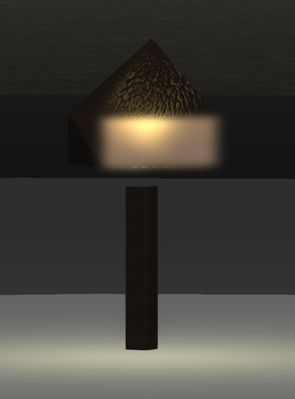
High LOD (2700 triangles)

Medium LOD (692 tris)


Low LOD (313 tris)


Lowest LOD (14 tris)

Each of the above shows a different level of detail for a 1920s style lamp made by me (click them to look closer.) 

How does LOD work?

As Loki Eliot once stated, the best way to visualise LOD is to consider a series of concentric rings around an object; as the camera passes from one ring to another the viewer changes to the next LOD model.

Here, with Loki's permission, is an animation of his original illustration.

As you can see, the further the viewer is away from the object the simpler the representation. The illustration exaggerates for effect, of course, and a well-designed object should decay gracefully as it vanishes into the distance.


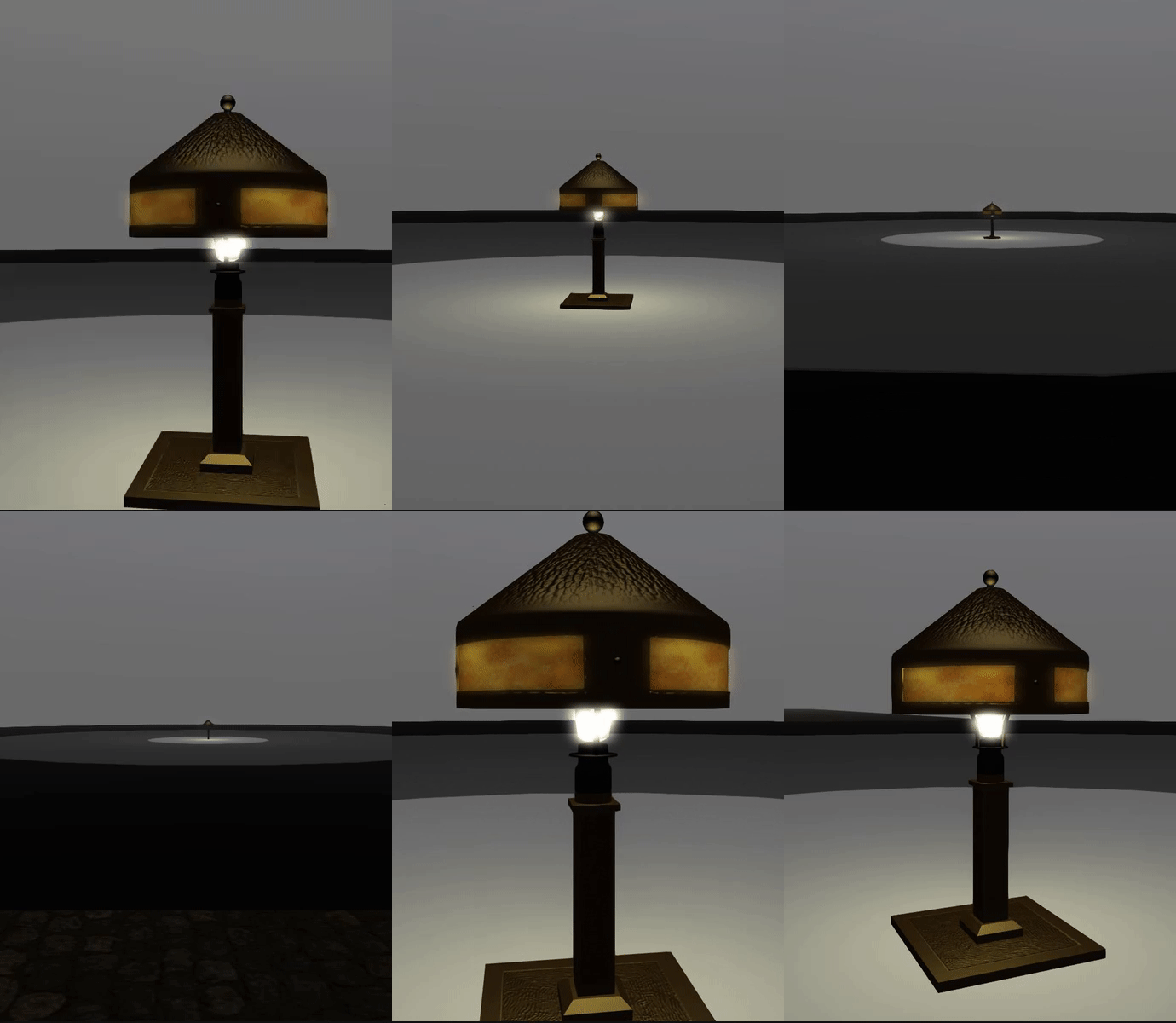
This second short animation loop shows a real object, the same table lamp that was shown above in its constituent models, this time viewed in-world on a platform of rings that represent Loki's concentric circles.

The viewer can be seen switching between these versions as the camera retreats away and approaches again.


The embedded image barely shows the changes at all; when viewing it full size, the switch is noticeable, but not so much as to distract you if you were focussed on nearby objects. 


How is LOD used?

It is the job of the creator of an object to specify what an object looks like in each of these simpler forms when they upload it to Second Life. A well-designed product should be recognisable at a distance, and the changes between models should not be so noticeable as to distract the user.

To encourage good design behaviour, and prevent someone setting all the LOD models to the same high detail version, Linden Lab levies a higher Land Impact penalty on objects with more complex, lower-detail models. The idea was to reward efficient object design with lower land impact. It never quite worked out

Where did it all go wrong?

Many creators understand how their creations affect the user experience and carefully craft models for each LOD to ensure that the user experience is good. However, for a long time now, there has been an unfortunate tendency with some designers towards skimping on the low detail models (often specifying just a single triangle) to artificially lower the Land Impact and make them seem "more efficient". This, of course, means that the object will crumple quickly as you move away from it, so they compensate for this by telling the users to "adjust their settings" to "see the product as intended." This has a significant impact on the overall performance capability of Second Life.

What is LOD Factor?

Remember those concentric circles I mentioned above? Each circle represents the boundary line either side of which a different LOD model is shown. How far away those boundaries are from the object is controlled by the size of the object and a thing called the LOD Factor. Irrespective of the size of an object, the larger the LOD Factor, the further apart those rings will be, and the wider the area that the models are visible for. With LOD factors that are high, everyday objects are drawn in "full detail" even if they are barely visible on the screen.

Why is changing LOD Factor so bad?

The LOD Factor setting is a global adjustment; it affects everything that you see. Every object in view, no matter how large or small, will have its LOD behaviour altered according to that setting.

By the act of setting an arbitrarily high LOD Factor, because your favourite sofa at home crumples when you stand by the door, the viewer will be forced to draw the high detail model for all objects a lot more often. Consider the extreme case of a jewelled earing worn by one of the crowd in a shopping mall, perhaps no more than a few pixels on your screen. In spite of the size, the viewer will have to try to draw every facetted jewel and tiny metal clasp just because a designer was unwilling or unable to design a proper LOD model and told you to use a debug setting instead. 

How do you find better content?

"Ok, ok, enough already, I get it. Bad content, has bad LODs. But how do I find the good stuff?"

One simple rule of thumb is to avoid content that tells you to adjust your viewer settings to see it properly. If an object comes with a notecard or other "advice" to increase "RenderVolumeLODFactor", then the chances are that the object will not have well designed LOD models. However, with the new release of Firestorm, you will also have better tools and be able to inspect an item in-world to see exactly how it behaves.

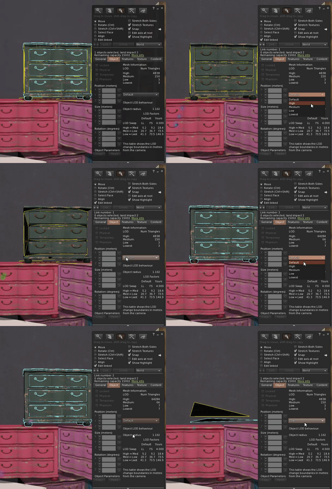
The new Mesh Info panel is described in my previous blog post. Using the LOD display function, you can look at the different LOD models, and in the information table, you can now also see what distance the concentric LOD rings would be at for both LL and FS default LOD Factor settings.

When evaluating an item, consider the way it will be used. Outdoor objects such as cars are likely to be seen from far greater distances than a piece of furniture, and remember too that even if you adjust your LOD Factor higher, your friends may not and will not be so impressed by the pile of crumpled triangles parked outside.

An indoor item may never be expected to be seen outside of a room so the designer may have made legitimate choices to economise, use the tools to decide. The chest of drawers in the image to the right will start to collapse at 5m for anyone on the Linden Lab viewer default settings. In a small house this is fine, but in a stately bedroom this may not be so desirable.

Will this situation change?

I hope that with these changes people will be empowered to start to take control of their SL performance and make better choices, but there is a stronger incentive too. As Second Life continues to grow and evolve, new features are being added and old features modernised. With each new development, there are extra demands on the viewer to draw them. To balance this equation and to keep the world accessible to as many as possible, more needs to be done to encourage efficient Second Life optimised content. There are very strong suggestions that the way that Land Impact is calculated will change, penalising poor content in favour of well-designed content. How this will be achieved is as yet unknown, but the writing is on the wall for bad content.

I hope this has helped to explain a complex and somewhat technical topic without too much techno-babble.

See you soon.

Love 

Beq.
x